I usually don’t talk much about my individual process here, mostly because I’m not sure who’d be interested, but today I thought I’d break with precedent and take you step-by-step through a recent project I did for my buddies in the band Hawkline.
Long story short, they saw my work on Calamity, said they were putting out an album called “Shipwreck,” and that my stuff might be a good match. So I said, “Cool. Let’s do it.”
I tend to look at everything through the medium of collage: all we’re really doing with art is taking things that we’ve seen and making something we can call our own. Borrowing. Stealing. Mixing. We take the words we know and put them into sentences. We take the notes we know and put them into melodies. We take the experiences we have and shape them into stories.
Etc.
I’d say that 90 percent of my process is fumbling around in a sketchbook, 10 percent is execution. In this case, they caught me in a brush phase, so I came up with this concept:
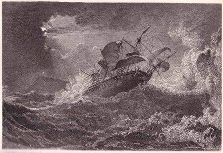
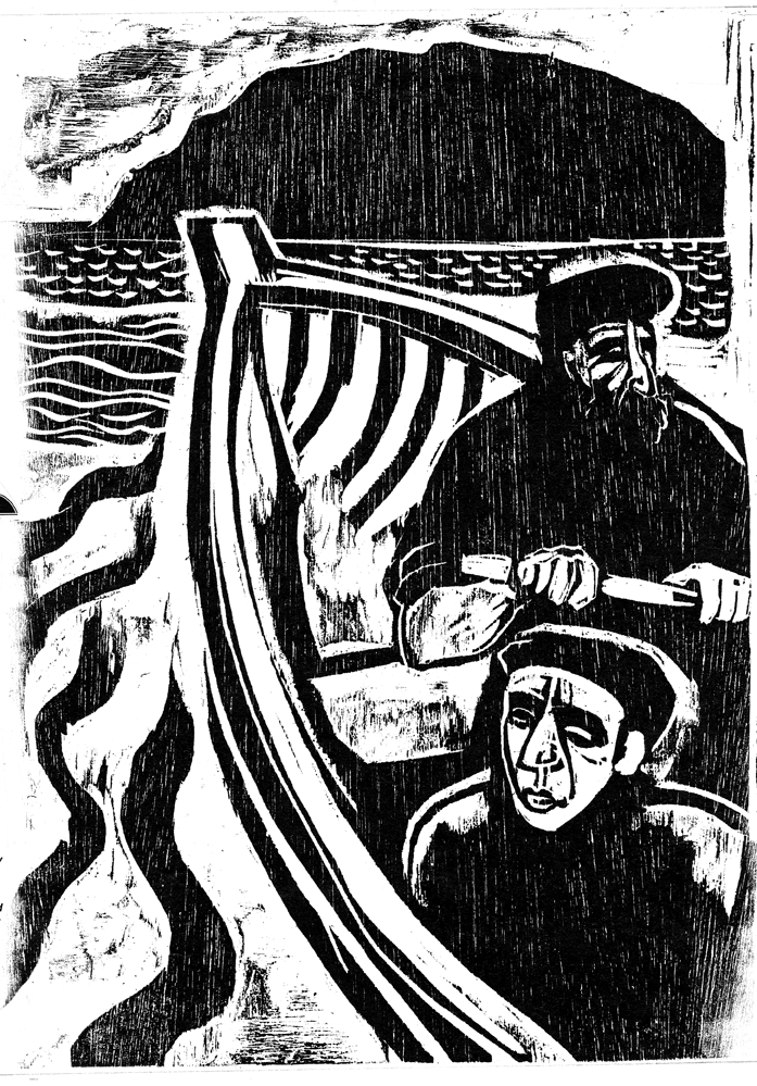
What did Picasso say? “Good artists borrow, great artists steal?” Well, I ripped that cover idea off of an old engraving I came across:
Anyways, the band liked the idea, but decided they wanted to put out an EP before the album. I thought I could do a lot better than the original design, so I started looking for inspiration. I remembered R. Crumb’s cover for Big Brother and the Holding Company’s Cheap Thrills:
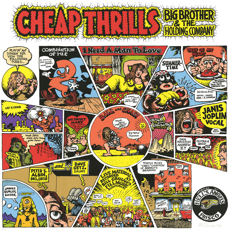
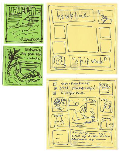
Funny story about that cover: originally it was supposed to be the back cover for the album, but Janis liked it so much she had it put on the front. But anyways, I liked the way the artwork was splintered into comic panels, so I said, “Okay, sure — I’ll rip that off with woodcuts.” I began doodling on post-its for a layout:
At this point, I thought I had a good idea of where the cover was going, so before making a bunch of artwork, I decided to finish their logo first. A couple of months back I had already doodled some logos while staying at Corey’s house. Hawkline’s sound is pretty muscular, so I wanted something stark and simple. (Something that would look good on a sticker or a tattoo.)
There just happened to be a Ketel One Vodka ad staring up at me from the back cover of a Rolling Stone:

Now, the font that Ketel uses is just a font called Bradley, that all kinds of places use:

So I ripped that off:
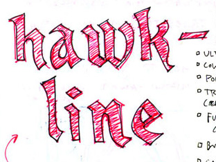
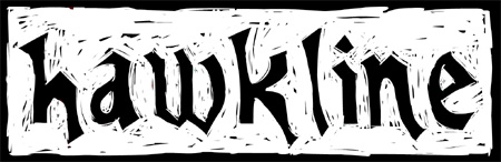
And came up with a final version. Keep in mind, I’m hand-lettering this:
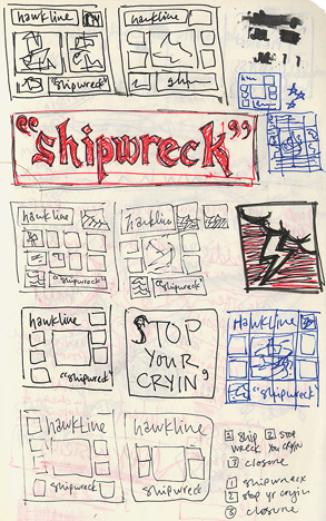
I liked that a lot, so I thought I’d just do the title of the EP in the same font as a kind of anchor for the cover. I also played around with layouts, drawing a bazillion thumbnails:
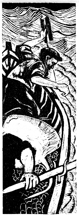
Now that I had the layout pretty much figured out, I concentrated on the final artwork. I found these cool woodcuts by an artist named Kim Atkinson:
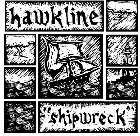
With those as inspiration, I finished the front cover:
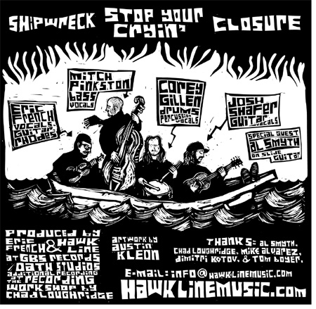
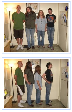
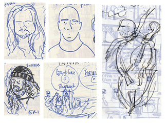
Now to the back. The band members said they’d be interested in having me cartoon them, so I had them send me some mugshots:
Which I used to doodle caricatures:
I thought the idea of a band playing in a lifeboat was a fun one, so I used that and hand-lettered the information they wanted listed for the back cover:
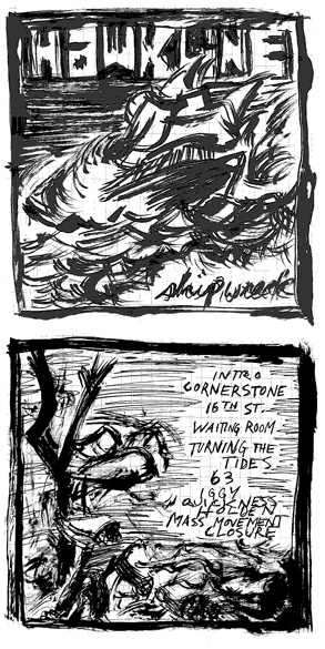
I have to admit, I almost like the back cover more than the front. Since the cover and the back were so busy, I thought a simple CD design was the way to go:

So there you have it. Hope that wasn’t too terribly boring. Check out Hawkline. The guys have my favorite song, “Stop Your Cryin’,” [MP3] streaming on on their myspace.
Now I want to hire you to do something. I don’t actually have anything for you to do…
Are you in Texas yet?
We’re pulling in Wednesday morning next week: the Big Move starts monday!
That was terribly awesome. I love “process” essays, hope to see more.
Your collage comments in the first part reminded me of William Gibson’s comments in his Amazon interview: “The thing that limits you with Google is what you can think of to google, really. There’s some kind of personal best limitation on it, unless you get lucky and something you google throws up something you’ve never seen before. You’re still really inside some annotated version of your own head.”
Different application, but there is a kind of kinship about creative limitations, your potential growing with your exposure, the hypertextual nature of creative influences, that kind of thing.
Sign me up with Maureen – clearly I’m going to have to write a book with you in mind for the cover art. Or, I could just take up an instrument, get together a band, and then . . . Wait a minute — that could take a while. I’ll think of something.
Meanwhile: safe travels! See you here soon!
Mark: That’s a REALLY awesome quote. Maybe I’ll do some more process essays in the future.
Tim: Two ENTPs with the same birthdays…collaborations could be dangerous! See you soon!
Great work, Austin. It’s really enlightening to see how the project progressed through its various steps. I might just buy Shipwreck, if for no other reason than to add to my Kleon collection. (Admittedly, there’s only one other item in the collection so far – that issue of Backwards City that included “After the War.”)
Thanks, Pete! I need to work on expanding the items in that Kleon collection…