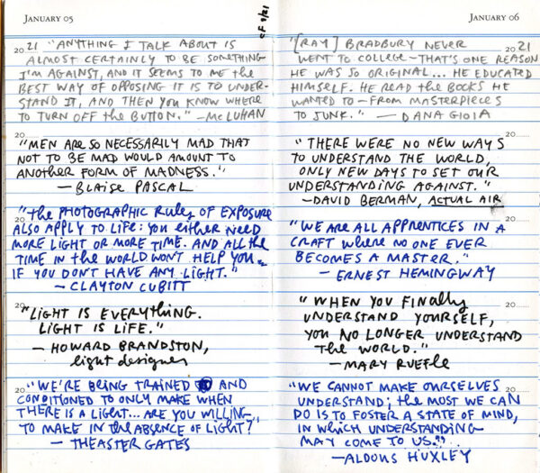
BLOG ARCHIVES

NOTES ON WRITING AND DRAWING

Craft, technique, and theory of writing and cartooning.

HOW-TO BOOKS

Tuesday, November 11th, 2008

So many artists are secretive about their process of making art. As if the magician revealed his tricks the magic would be lost.

Thanks to my wife, I’ve recently become inspired by the crafting community (see my posts on D.I.Y. and Maker Faire.) These folks not only peddle their art, they show you how they made it, and invite you to make along with them.

I’m working on a “how-to” section for my book so that people can try our their own poems. I’ve been pillaging my own favorite how-to books for inspiration. Books that don’t just show you how to make art, they’re works of art in themselves. These books have a spirit of generosity and inclusiveness. They believe that anyone can make art. They invite you to play and make along. Here are four of my favorites:

* * *

One! Hundred! Demons!
by Lynda Barry

One! Hundred! Demons! by Lynda Barry

One! Hundred! Demons! by Lynda Barry One! Hundred! Demons! by Lynda Barry

One! Hundred! Demons! by Lynda Barry One! Hundred! Demons! by Lynda Barry

Barry begins her book with a comic strip about how she discovered the japanese sumi-e brush and ink, and how it opened up a whole new world of creativity for her. She says she “hopes you will dig these demons and then pick up a paintbrush and paint your own! Sincerely! Pass it on! I had so much fun!”

And after 200 pages of her “autobifictionalographic” comics, she has a 10-page section in the back detailing what type of brush, ink, and inkstone you’ll need to try your own. “Come on! Don’t you want to try it??”

* * *

What It Is
by Lynda Barry

What it is! By Lynda Barry

What it is! By Lynda Barry What it is! By Lynda Barry

Barry’s next book follows roughly the same structure: half the book is a crazy collage/comic memoir, and the other half is a “how-to” writing workbook based on her Writing The Unthinkable! workshops.

* * *

Whatcha Mean, What’s A Zine?
by Mark Todd and Esther Pearl Watson

Whatcha Mean, What's A Zine?

Whatcha Mean, What's A Zine? Whatcha Mean, What's A Zine?

Rad book about making mini-comics and zines. As Mark and Esther say in the introduction, “We wanted to make a book that we would have loved to have found when we first started our mini-comics.” It includes sections by comics superstars like Ron Rege, John Porcellino, Anders Nilsen, and Dan Zettwoch.

* * *

Ed Emberley’s Drawing Book: Make A World
by Ed Emberley

Ed Emberley's Drawing Book: Make A World

Ed Emberley's Drawing Book: Make A World Ed Emberley's Drawing Book: Make A World

Ed Emberley's Drawing Book: Make A World Ed Emberley's Drawing Book: Make A World

This is a book from the late 70s I’ve only recently stumbled upon. Ed Emberley shows you how to “make a world” with just a few simple shapes, step-by-step. I love the emphasis on simplicity: if you can draw a triangle, a square, a circle, and a line, you’re good to go.

Here’s a great little video review of the book by Chris Glass.

* * *

What are your favorite “how-to” books?

STORYTELLING = WORLD-BUILDING

Wednesday, November 5th, 2008

Note: spurred on by Mark’s excellent comment on my “new house” post, I’m posting this excerpt from my undergrad thesis I wrote in the spring of 2005 (pre-blog). The thesis was called “Pictures Before Words,” and it was about using visual thinking techniques like clustering and storyboarding to create prose fiction. It’s surprising to read back through it now, and realize how much it laid out the ideas I would explore in the next 3 years or so: sense of place and writing as world-building, the connection between pictures and words…thanks to Sean Duncan for introducing me to a lot of the material!

* * *

IN CHAPTER FOUR of Dylan Horrocks’ graphic novel, Hicksville, a character named Dylan Horrocks and a character named Grace travel to a land named Cornucopia to meet its greatest cartoonist, Emil Kopen. Upon their meeting, Kopen refers to himself not as a comics writer, but as a “cartographer” or a “maker of maps.” This puzzles Horrocks, and prompts Grace to ask Kopen to explain. Kopen says that comics are the same as maps because they are “using all of language—not only words or pictures.” Horrocks asks Kopen about the purpose of maps.

“Maps are of two kinds,” Kopen explains. “Some seek to represent the location of things in space. That is the first kind—the geography of space. But others represent the location of things in time—or perhaps their progression through time. These maps tell stories, which is to say they are the geography of time.”

maps tell stories which is to say they are the geography of time

This monologue is quite similar to Scott McCloud’s argument about comics in Reinventing Comics. He argues that space is the form of comics, and time the content: comics work by mapping time.

reinventing comics scott mccloud comics as an artists map of time

In Horrocks’ online article “Comics, Games and World-Building” (highly recommended) he responds to McCloud’s argument by exploring and expanding the theories of James Kochalka. In Kochalka’s comic, The Horrible Truth About Comics (included in The Cute Manifesto), he proposes an alternative definition of comics to McCloud’s: comics as world-building. “Comics are a way of creating a universe.”

comics are a way of creating a universe and populating it with characters using a secret code

Horrocks interprets:

Now, most discussion about comics (or fiction, for that matter) assumes that their main purpose is to tell a story – a narrative that moves through time; hence McCloud’s description of comics as a "temporal map." But here, Kochalka seems to suggest something quite different: that comics create a world, a place. Instead of SPACE = TIME, this is SPACE = SPACE.

Even those narratives that would seem to be primarily interested with mapping time, with telling stories, or plots, can be seen in spatial terms. Horrocks’ character Emil Kopen explains to the character Dylan Horrocks that along with maps of geography, he feels that “stories, too, are basically concerned with spatial relationships. The proximity of bodies. Time is simply what interferes with that, yes?”

i have begun to feel that stories too are basically concerned with spatial relationships

In Writing Fiction, Janet Burroway writes that while plot has often been seen as a type of “power war” or “back and forth” that seems to be going on between characters, “narrative is also driven by a pattern of connection and disconnection between characters that is the main source of its emotional effect.” Connection and disconnection are spatial terms; they imply different degrees of proximity.

Horrocks observes that the notion of “world-building” has mostly been popular within the genre of fantasy (i.e. J.K. Rowling’s Hogwarts, or Tolkien’s Middle Earth). But Horrocks suggests that “all writers are engaged in ‘sub-creation,’ to the extent that all fiction takes place in a ‘Secondary World,’ no matter how closely it may resemble the ‘real world’ in which we live.” No matter what genre you write in, you can use the same world-building techniques used by fantasy artists and writers.

When we read comics and fiction or watch movies, we are asking the artist to take us into a universe of his making. In the words of Kochalka, “When we encounter a great work of art the physical world fades away as we step into this new reality. We are alive in a living world.” This sounds remarkably similar to John Gardner’s idea of fiction as “a kind of dream” that the reader falls into: “We read a few words at the beginning of the book or the particular story, and suddenly we find ourselves seeing not words on a page but a train moving through Russia, an old Italian crying, or a farmhouse battered by rain. We read on—dream on—not passively but actively."

If writers and cartoonists accept the idea that what they must first do to create a convincing narrative is world-build, the next step is to wonder how they might go about such a thing.

Alan Moore, in the chapter entitled “Worldbuilding; Place and Personality” in Alan Moore’s Writing for Comics, suggests that world-building simply means coming up with the working details of your world and environment before you actually go about writing your story. He suggests coming up with

a mass of information about the world and the people in it, much of which will never be revealed within the strip for the simple reason that it isn’t stuff that’s essential for the readers to know and there probably won’t be space to fit it all in. What is important is that the writer should have a clear picture of the imagined world in all its detail inside his or her head at all times.

Moore suggests that gifted writers will avoid dropping huge amounts of detail on the reader at one time, but instead use these details sparsely in each frame, to suggest that there is a world going on outside of the frames of the comic. This idea parallels Scott McCloud’s theory of closure—“the comics creator asks us to join in a silent dance of the seen and the unseen. The visible and the invisible.” The comics reader is required to fill in the details of the world going on outside the comic panel, and this will succeed only if the world is concretely realized by the creator.

My argument is that the artist can see written fiction, comics, and film as multiple disciplines on the spectrum of storytelling. Although they all have different ideas about what a story is and how you build and present a story, if we accept that what each discipline does is world-build, then we can use the term “world-building” to move fluidly between disciplines. When we have the world-building tools and processes mastered from multiple disciplines of storytelling—whether it be drawing in the case of comics, or writing in the case of fiction—we can use these tools and processes across disciplines to generate the worlds that we imagine.

Recommended reading:

GET YOURSELF A CALENDAR

Sunday, October 26th, 2008

Newspaper Blackout Poems Book Calendar

Several months ago, I was at a talk by comics artist Jessica Abel, and somebody asked her for her number one productivity tip. She said, “get yourself a calendar. Here’s what she has to say (emphasis mine):

“Get yourself a calendar, and schedule the work you have to do in there. Make sure the calendar is the type where you can see a day or a week at at time (not a month at a time), so there’s room to write under each day. Then, mark in any regular commitments you have…Once you’ve got all that there, you will be able to see how much time you really have to work….In the time you have for work, assign yourself very specific tasks…Taking a little time to get all this in your book will do several things for you. It will become clear to you how much you can reasonably get done in a week. It will become clear where you might need to shorten your daily activities to fit in more drawing. And, most importantly, it will give you concrete goals, so that when you finish what you set out to do, you can cross it off and feel good about yourself, and you can also stop working, sometimes the hardest thing to do for a freelance artist. Knowing when you’re on and what you need to get done makes your free time, once you’ve accomplished these goals, truly free, guilt-free. And that’s the most important part of learning to make a life as a working artist.”

When I started the book at the end of June, I knew I had six months to get the manuscript finished. 25 weeks to make 150 brand-new poems. That’s 6 poems a week, one poem a day…if I took a sabbath. But there was no way each poem was going to be worthy of being collected in the book. So I decided to shoot for a 3/5 success rate (which is still way too optimistic), and make 250 poems in 25 weeks. 10 poems a week. Out of the 250, I’d throw out 100, and still have 150 for the book.

250 poems!

I couldn’t see it happening, so I drew it. 25 rows, 10 checkboxes. If I was doing everything right, by Christmas all the checkboxes would be full.

And that’s how I’ve been living for the past four months. Every week, there are 10 checkboxes to be filled, and I fill them. At the end of every poem, there’s the satisfying X.

Creating any long work of art is all about time management. Any goal you want to accomplish: get yourself a calendar. Break the task down into little bits of time. Make it a game.

But don’t just take it from me, take it from Frank TJ Mackey!

WAYS OF SEEING BY JOHN BERGER

Sunday, October 19th, 2008

WAYS OF SEEING by John Berger

Fantastic book based on the 1972 BBC miniseries, which someone has uploaded to Youtube, and I’ve assembled into one handy playlist for your viewing pleasure. Amazing how much the contents remain valid in the age of the internet.

The first essay is about art in the age of photography and reproduction, and is based on Walter Benjamin’s essay, “The Work of Art in The Age of Mechanical Reproduction.” Benjamin’s idea was that in an era where an image can be easily reproduced, art might be “freed up” and become available to a mass audience.

I’ve recently been going back and forth with an artist friend of mine about his fine-arts-based world (where his collectors value the original, one-of-a-kind) and mine (where there is no original, only reproductions, on the blog, in the book, etc). Our ideas about making art are very similar, but our business models couldn’t be more different!

I was with him and our wives at an opening in an art gallery in town last night and couldn’t get over how uncomfortable I felt about the whole thing. There was free beer, sure, but no artist’s statement, no postcards, nothing. There was only a photocopy of the price list, along with some goofy map of the exhibit that related “culture vs. nature” or something cliched along those lines…

Why so uncomfortable?

First, the idea that anyone has $10,000 to spend on a piece of art boggles my mind. Second, I find it alienating, as someone without the $10,000 to spend on art, to not be able to “own” or “buy into” or “take home” some part of the work. Regardless of how much you love the art, there’s nothing he can sell to you, there’s nothing you can buy into, no way for you to show your support or love for the work. All you can do is snap a bootleg shot on your camera phone. You feel like a f*&%ing second-class citizen: You can look, but don’t touch. It’s worse than a museum: at least in a museum you can buy a postcard or a book in the gift shop.

Contrast this with my experience at Maker Faire earlier in the day, where the idea was: come make things with us. Everyone is encouraged to join in.

Take our friends Bleep Labs. They had:

  • Robots on sale for $125
  • T-shirts on sale for $20
  • Stickers for free

Art in the age of mechanical reproduction, indeed! Every level of merchandising was covered.

More thoughts on this to come.

ways of seeing ways of seeing

OTTO DIX, “PORTRAIT OF THE LAWYER HUGO SIMONS”

Wednesday, October 15th, 2008

Otto Dix, "Portrait of the Lawyer Hugo Simons", 1929 

This 1929 portrait is the best thing hanging in the Montreal Fine Arts Museum. Absolutely stunning. 

Otto Dix, "Portrait of the Lawyer Hugo Simons", 1929

Otto Dix, "Portrait of the Lawyer Hugo Simons", 1929

Study of Otto Dix's "Portrait of the Lawyer Hugo Simons"

More on Otto Dix, who was part of the amazing Glitter and Doom show we saw on our honeymoon.

FRIDA KAHLO ON WANNABE ARTISTS

Monday, October 6th, 2008

frida kahlo letter to nickolas muray

In some recent reading I ran across this hilarious passage written by Frida Kahlo to her long-time affair and lover, the photographer Nickolas Muray. In 1939, Kahlo was in Paris trying to get a show when she got sick and had no help from André Breton. She was rescued by Marcel Duchamp, who she called “a marvelous painter…who is the only one who has his feet on the earch among all this bunch of coocoo lunatic sons of bitches of the surrealists.” She goes on:

I have decided to send every thing to hell, and scram from this rotten Paris before I get nuts myself. You have no idea the kind of bitches these people are. They make me vomit. They are so damn “intelectual” and rotten that I can’t stand them any more. It is realy too much for my character. I rather sit on the floor in the market of Toluca and sell tortillas than to have anything to do with those “artistic” bitches of Paris. They sit for hours on the “cafes” warming their precious behinds, and talk without stopping about “culture” “art” “revolution” and so on and so forth, thinking themselves the gods of the world, dreaming the most fantastic nonsenses, and poisoning the air with theories and theories that never come true. Next morning, they dont have anything to eat in their houses because none of them work and they live as parasites of the bunch of rich bitches who admire their “genius” of “artists”. Shit and only shit is what they are. I never seen Diego or you, wasting their time on stupid gossip and “intelectual” discussions. that is why you are real men and not lousy “artists”. Gee weez!

Sound like anyone you know?

Read more:

THE POWER OF CAPTIONS: WORDS ADDED TO PICTURES

Monday, September 1st, 2008

Yesterday, I was thinking about telling a story in pictures without words, and so today, in the aftermath of all the Sarah Palin pregnancy conspiracy theory madness, I started thinking about telling a story with words added to pictures.

The documentary filmmaker Errol Morris had it nailed in his NYTimes article, “Photography As A Weapon,” about photoshopping, forgeries, image processing, captions (and John Heartfield and King Geedorah!):

Doctored photographs are the least of our worries. If you want to trick someone with a photograph, there are lots of easy ways to do it. You don’t need Photoshop. You don’t need sophisticated digital photo-manipulation. You don’t need a computer. All you need to do is change the caption.

I don’t know what these buildings were really used for. I don’t know whether they were used for chemical weapons at one time, and then transformed into something relatively innocuous, in order to hide the reality of what was going on from weapons inspectors. But I do know that the yellow captions influence how we see the pictures. “Chemical Munitions Bunker” is different from “Empty Warehouse” which is different from “International House of Pancakes.” The image remains the same but we see it differently.

Change the yellow labels, change the caption and you change the meaning of the photographs. You don’t need Photoshop. That’s the disturbing part. Captions do the heavy lifting as far as deception is concerned.

If you read through this Daily Kos piece, the writer presents pictures of Palin at various stages of her pregnancy looking thin and trim as “evidence” that she wasn’t really pregnant with her fifth child, but it was her daughter, Bristol, who was pregnant. The article is simply a list of photographs with captions—and the captions control how we read the photographs.

Many folks pointed to this picture as evidence of a Bristol Palin “baby bump”:

Palin Family

A picture which would otherwise be an innocuous portrait of a nice-looking family is turned into a sinister conspiracy by the words, or caption, adjacent to it.

bristol palin is pregnant

The moral of the story is that pictures can say whatever we want them to say, provided we use the right words.

The power of captions can be used for good, or it can be used for evil. For a cartoonist, it’s a potent weapon, which can take any drawing and turn it in many different ways. Take this hasty doodle:

captions

Depending on which captions I use, you’ll get a different picture of who I am, yes? In comics, it seems, the old creative writing adage “show don’t tell” is useless—you can certainly tell as much as you show, show what you tell, or tell what you show.

this is not a pipe

I’d love to hear your own thoughts on the use of captions in the comments below. I also recommend taking a look at Derik Badman’s article, “Text In Comics.”

WORDLESS BOOKS AND WOODCUT NOVELS

Sunday, August 31st, 2008

wordless books

A story is told in images.

You can do it with words, you can do it with pictures, or you can do it with both.

For those interested in doing it just with pictures, there are two books in print right now on woodcut novels and wordless books that are absolute must-reads. First, for an overall sampler and history of the form, get David Beronä’s Wordless Books: The Original Graphic Novels. Beronä is the Library Director of the Lamson Library at Plymouth State University, and he’s been researching woodcut novels and wordless books for twenty years.

Beronä begins with the granddaddy of it all and my personal favorite, woodcut artist Frans Masereel, and points out three major elements that were in the air when Masereel started to create his works:

1) the revival of the woodcut, mostly thanks to the German Expressionists
2) silent cinema, and a “public already familiar with black-and-white pictures that told a story”
3) newspaper cartoons

Beronä goes on to trace the development of the form, including some of my other favorites: the woodcut novels of Lynd Ward (whose name spelled backwards is “draw”) and Otto Nuckel, Milt Gross’s cartoon novel He Done Her Wrong, and Istvan Szegedi Szuts’ ink + brush piece My War.

In the book’s introduction, the the fantastic cartoonist and scratchboard genius Peter Kuper mentions the biblical story of the Tower of Babel and locates wordless woodcut stories as part of humanity’s ongoing quest to use images and symbols to “sidestep our language barriers and create…stories that can be universally understood.”

“Looking for similarities among these artists you find that many share a contrasting use of black and white, dark and light, with a dash of yin and yang. Most also share a connection through choice of materials. From wood engraving to leadcut to linoleum printing, these artists have chosen a medium with a process beyond the immediacy achieved of putting pen to paper. There is a unique quality to these print images that is arresting and iconic. It’s as thought the art were announcing a rally and needed to be read as easily on a lamp post as seen in a book.”

It’s no coincidence that Otto Neurath turned to woodcut artist Gerd Arntz to create the symbols for his celebrated Isotype system of pictorial communication. There’s something in the stark black and white of woodcut and ink and brush that leads to that iconic quality…

graphic witness

…which brings us to the second book and perfect companion to Wordless Books, Graphic Witness: Four Wordless Graphic Novels, which collects in their entirety Frans Masereel’s The Passion of a Man, Lynd Ward’s Wild Pilgrimage, Giacomo Patri’s White Collar, and Laurence Hyde’s Southern Cross. The book was edited by woodcut artist and printmaker George A. Walker. From Walker’s introduction:

As a woodcut artist, I’ve always been attracted to black-and-white art. I think it has something to do with the rich contrasts. I love a deep rich black that you can stare into, forever. The effect is like our colorful world torn down to its base so that we can read the unerlying message. The truth is always easier to take in black and white. Typography is always more legible in black and white, so why would we be surprised to find the readability of artworks enhanced by those contrasts? Remove the grays and hues, reduce the image to lines and solid blacks, and open up the whites. You have a thing of beauty and simplicity.

Another way to understand our attraction to black and white is through the science of how we see. The human eye consists of rods and cones that process the reflected light of our world. These signals are then translated into color and form for processing by our brain. The rods, which are sensitive only to black and white, are the first components activated in a baby’s eyes. That’s why infants readily respond to high-contrast black-and-white images. We are hardwired to appreciate black-and-white artwork.

In addition to the great service of publishing these complete works together, the introduction to the book gives a history and overview of relief printmaking techniques (see this MOMA infographic, “What Is A Print?“), focusing on the tools used to create the images:

Clement Moreau linocut from the book GRAPHIC WITNESS

As anyone who’s familiar with my comics and illustration work should know, I owe a great debt to this form and these artists, and I can’t wait to finish this book of words, so I can get back to making stories out of pictures again! (For those who haven’t seen my previous feeble attempts, see: “Birdseed,” “After the War,” and my abandoned graphic novel, “A Terrible Calamity At Sea!“).

And for those interested in digging further into this subject, check out my Amazon Listmania! List for Wordless Graphic Novels + Comics.

WILLIAM BURROUGHS 1965 PARIS REVIEW INTERVIEW

Wednesday, August 20th, 2008

In 1965, the writer William Burroughs was interviewed by the Paris Review. He was 50, living in a hotel in his hometown of St. Louis. A short time later, across the pond, an artist named Tom Phillips read the interview, and decided to play with Burroughs’ cut-up method by doing “column-edge” poems with the New Statesman. He decided to take the method a bit further. He walked to a bookshop, and grabbed the first book he could find for 3 pence. He started blacking out the words, first with just a pen. It was beginning of a 40-year project now known as A Humument.

It’s easy to see how Phillips was inspired: this interview presents a brilliant mind at work, thinking about images and words and writing and how they go together. Burroughs claimed he was most interested in “dreams” and the “juxtaposition of word and image”: “precisely how word and image get around on very, very complex association lines.” He was an avid user of scrapbooks, kept files of newspaper clippings and photographs for character studies, and always wrote down his dreams. He also had a really interesting method of journaling: in three parallel columns, he would record the day’s events, his memories and what he was thinking at the time, and quotes from what he was reading. He called all this “taking coordinates”—a kind of “time travel” to see if he could “project” himself into one single point in time.

Combine this interview with the terrific Beat exhibit I saw earlier this year, and consider me impressed. (I confess that I’ve never made it through any of his books—first up on my list is his collaboration with Brion Gysin [the man who REALLY deserves most of the credit for the cut-up technique...more on that later], The Third Mind.)

Some of my favorite bits:

Seeing

Most people don’t see what’s going on around them. That’s my principal message to writers: For Godsake, keep your *eyes* open. Notice what’s going on around you. I mean, I walk down the street with friends. I ask, “Did you see him, that person who just walked by?” No, they didn’t notice him.

Writers and technology

I think that words are an around-the-world, oxcart way of doing things, awkward instruments, and they will be laid aside eventually, probably sooner than we think. This is something that will happen in the space age. Most serious writers refuse to make themselves available to the things that technology is doing. I’ve never been able to understand this sort of fear. Many of them are afraid of tape recorders and the idea of using any mechanical means for literary purposes seems to them some sort of a sacrilege.

The origins of the cut-up technique

A friend, Brion Gysin, an American poet and painter, who has lived in Europe for thirty years, was, as far as I know, the first to create cut-ups. His cut-up poem, Minutes to Go, was broadcast by the BBC and later published in a pamphlet. I was in Paris in the summer of 1960; this was after the publication there of Naked Lunch. I became interested in the possibilities of this technique, and I began experimenting myself. Of course, when you think of it, The Waste Land was the first great cut-up collage, and Tristan Tzara had done a bit along the same lines. Dos Passos used the same idea in ‘The Camera Eye’ sequences in USA. I felt I had been working toward the same goal; thus it was a major revelation to me when I actually saw it being done.

Objections to the cut-up technique

There’s been a lot of [objections to the cut-ups], a sort of a superstitious reverence for the word. My God, they say, you can’t cut up these words. Why can’t I? I find it much easier to get interest in the cut-ups from people who are not writers—doctors, lawyers, or engineers, any open-minded, fairly intelligent person—than from those who are….People say to me, “Oh, this is all very good, but you got it by cutting up.” I say that has nothing to do with it, how I got it. What is any writing but a cut-up? Somebody has to…*do* the cutting up. Remember that I first made selections. Out of hundreds of possible sentences that I might have used, I chose one.

World-building

You know, they ask me if I were on a desert island would I go on writing. My answer is most emphatically yes. I would go on writing for company. Because I’m creating an imaginary—it’s always imaginary—world in which I would like to live.

Read the complete article.

Any fans of Gysin or Burroughs out there? What texts would you recommend?

THE ART OF LIVING BY SAUL STEINBERG

Tuesday, August 19th, 2008

Saul Steinberg is one of my favorite cartoonists of all time. Tonight I found this 1949 first edition of his second book, THE ART OF LIVING, in a Half Price Books for $12. (See my other posts on Steinberg.)

THE ART OF LIVING by Saul Steinberg

THE ART OF LIVING by Saul Steinberg

THE ART OF LIVING by Saul Steinberg

Dig the line work:

THE ART OF LIVING by Saul Steinberg

The use of collage:

THE ART OF LIVING by Saul Steinberg

The counterfeit handwriting:

THE ART OF LIVING by Saul Steinberg

THE ART OF LIVING by Saul Steinberg

The music notation paper:

THE ART OF LIVING by Saul Steinberg

THE ART OF LIVING by Saul Steinberg

THE ART OF LIVING by Saul Steinberg

Terrific stuff. On cartoonist Mike Lynch’s blog, you can see some great scans of Steinberg’s first book, ALL IN A LINE.