In this great interview with James Hannaham, he talks about how his musical background influences his writing:
When you write pretty much anything, you’re essentially asking someone to read a musical score—to hear it in their head. So an attentiveness to sound and rhythm and meter is really useful to your aesthetic as somebody who’s putting words on a page. It’s pretty similar to putting notes on a staff, in its way.
This is also what Margaret Atwood says about writing books:
Books are frozen voices, in the same way that musical scores are frozen music. The score is a way of transmitting the music to someone who can play it, releasing it into the air where it can once more be heard. And the black alphabet marks on the page represent words that were once spoken, if only in the writer’s head. They lie there inert until a reader comes along and transforms the letters into living sounds. The reader is the musician of the book: each reader may read the same text, just as each violinist plays the same piece, but each interpretation is different.
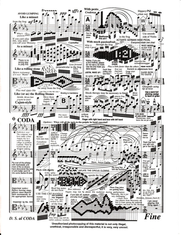
And also what Chris Ware says about comics:
What you do with comics, essentially, is take pieces of experience and freeze them in time….The moments are inert, lying there on the page in the same way that sheet music lies on the printed page. In music you breathe life into the composition by playing it. In comics you make the strip come alive by reading it, by experiencing it beat by beat as you would playing music…
Filed under: music