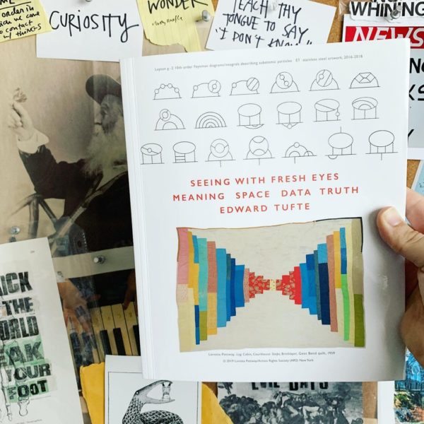
I’m doing something I haven’t done in 14 years: I’m reading a brand-new Edward Tufte book!
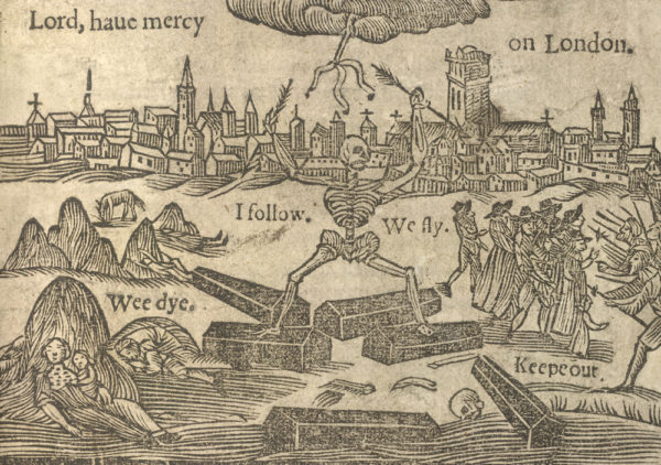
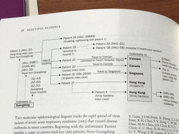
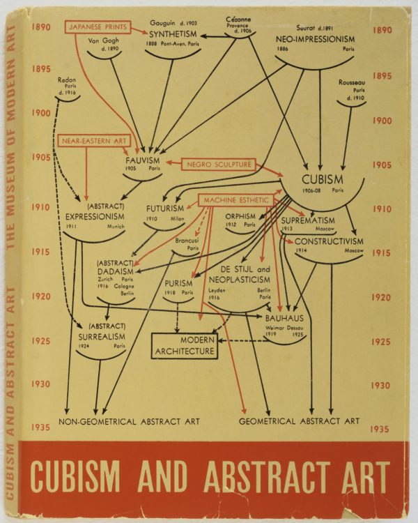
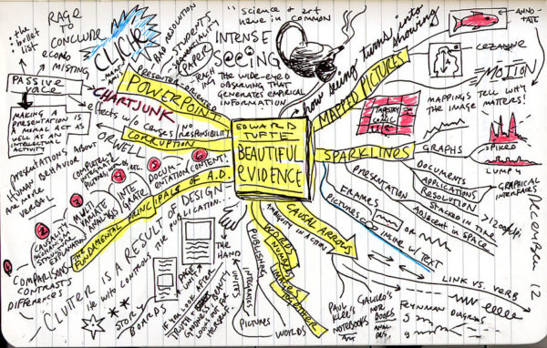
I first read ET’s books in 2006 when I was a 23-year-old librarian who didn’t even know there was such a thing as a designer. Here is a map I drew of Beautiful Evidence:
The books had a big impact on me, so much so that I applied to Carnegie Mellon’s information design program. (I got in, but wound up moving to Texas and becoming a web designer instead.)
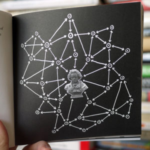
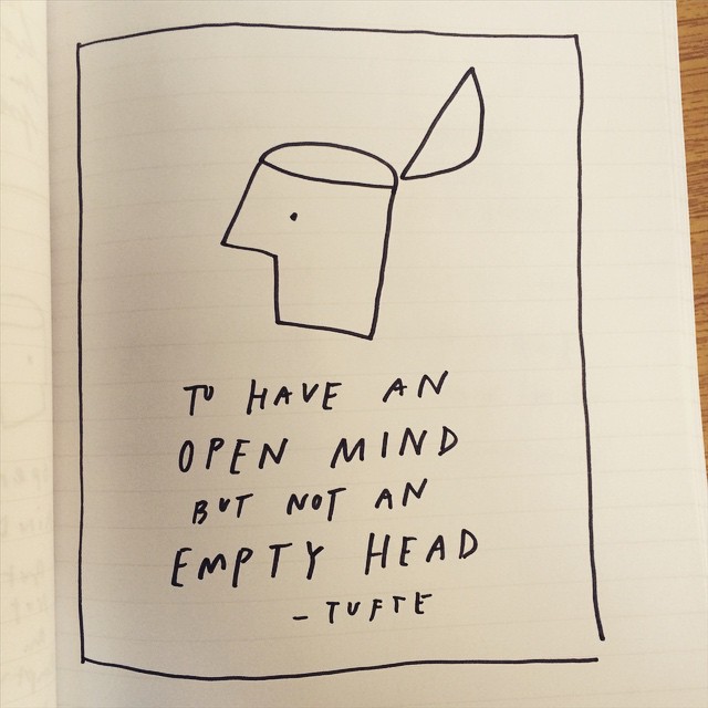
What, selfishly, delights me most about the book is that it contains one of my drawings from a Tufte seminar I attended in 2015:
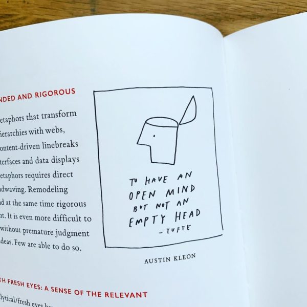
To go from drawing ET’s books to having a drawing in one of ET’s books… sometimes my life is pretty fun.